Charts & Mutual Fund Analyses
 By: Robert F. Abbott, freelance writer and author
Charts showing a fund’s price history can help when you do mutual fund analysis. But, what if those squiggly lines cause your eyes to glaze over and your brain to hit the pause button?
In this article, you’ll learn to value or rediscover the value of charts, as we tweak them to get rid of the noise and get closer to understanding a mutual fund’s history and possibilities.
More importantly, we will better understand the fund’s short- and long-term prospects. Not that we will be able to forecast any better, but we can build on the frequent tendency of funds (like stocks) to keep on doing what they’ve done in the past.
I’ll keep the jargon and technicalities to a minimum, to make the learning as easy and straightforward as possible.
Finding Top Mutual Funds for Analysis (with and without charts)
In previous articles, defining top mutual funds to meet your unique needs and researching mutual fund basics using the names and descriptions of funds, we went to several sources. Both Zacks.com and Morningstar.com hold eminent positions as independent assessors of mutual funds. But, I went with U.S. News & World Report, which builds its lists of best mutual funds by aggregating the rankings of other organizations (such as Zacks and Morningstar). I also like the way the U.S. News & World Report lays out its information for its best funds.
That information includes a chart, but to make a long story short, we will choose a fund from its best mutual funds lists, but not use it charts. Instead, we will use the more robust charts available from Stockcharts.com .
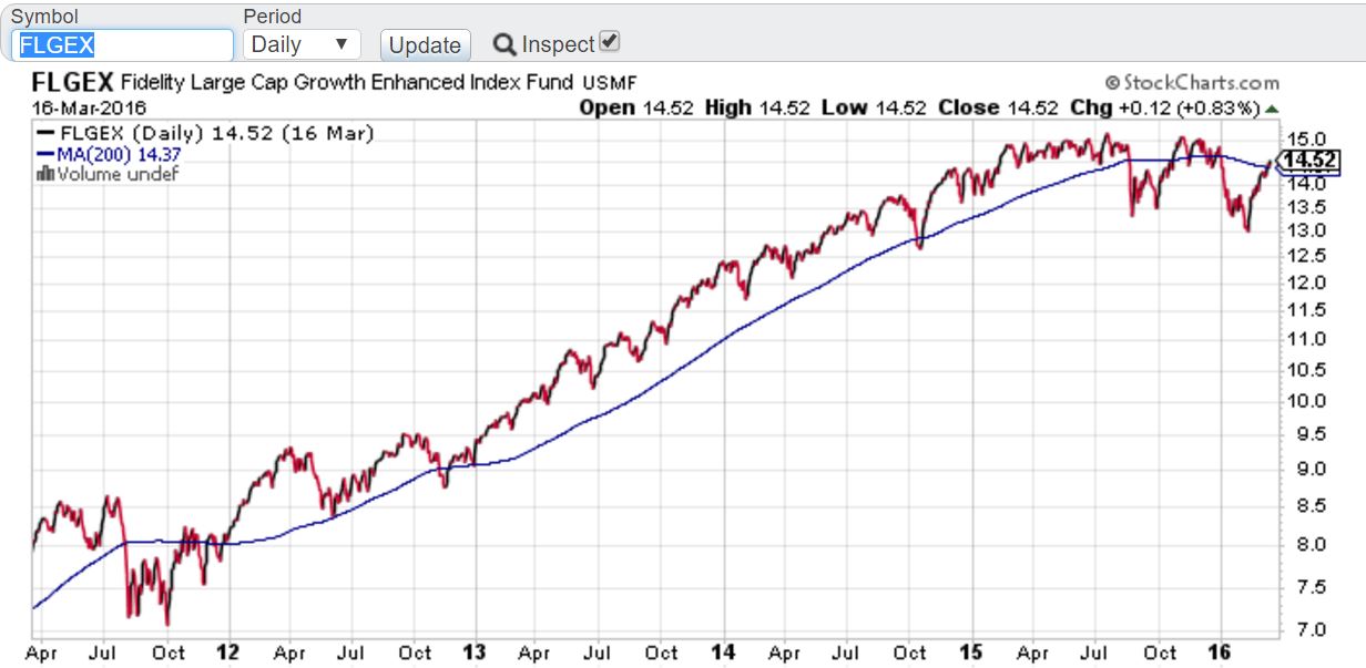
The fund I selected for chart analysis is the Fidelity Large Cap Growth Enhanced Index Fund (FLGEX). It comes at number 4 on the U.S. News & World Report’s list of best large growth funds.
Next, I went to Stockcharts.com , where I entered the fund’s symbol FLGEX; you can also enter it in lower case (flgex) if you wish. Make sure the Type of chart says SharpChart, and click on the Go button.
Note that this is a free site, but if you wish you can upgrade to access more features and tools.
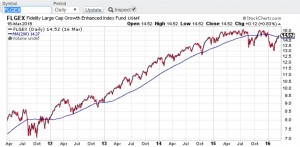
After pressing the Go button, you should see the chart for FLGEX:
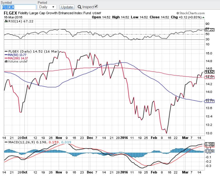
Confirm the symbol FLGEX shows in the chart header, and ignore everything else for now. Instead, scroll down to the area below that looks like this:
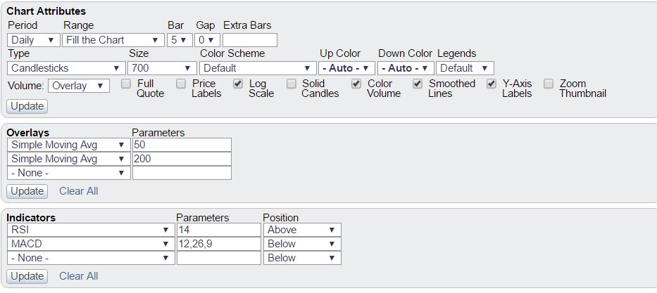
In the Chart Attributes area, select 5 Years from the drop-down menu that says Range/Fill the Chart.
In the Overlays area, choose None from the first drop-down menu (Simple Moving Avg 50); leave the Simple Moving Avg 200 as it is.
In the Indicators area, select None from the drop-down menus that say RSI and MACD.
Click the Update button at the bottom and wait for a moment. You should see something that resembles this (it will not be identical because the chart updates every business day):
Much simpler, and easier to grasp the important point (which we will get to in a moment). If you wish, you can expand the chart on your screen to make it even easier to read.
Analyzing the Chart of Price History
What we have now is a five year price chart with a 200-day Simple Moving Average (the blue line). The 200-day Simple Moving Average, or 200 SMA, shows us what the fund’s history looks like when we cut out the noise.
Obviously, the price has steadily increased until just recently. That steady rise helps explain why we find this fund on a Best Mutual Funds, or Top Mutual Funds, list. For contrast, let’s examine a fund that came from a worst list:
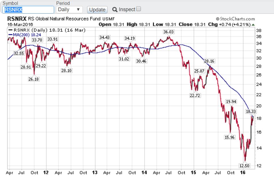
Oil, natural gas, and other commodities make up the bulk of this fund’s holdings, so it will come as no surprise that it began plunging last summer. But even before then, you will observe the fund had an undesirable profile, with the price basically flat after the noise comes out of it (following the 200 SMA).
Neither you nor I would want to invest in this fund, unless we think we can catch a bottom and make some quick money if the price jumps significantly. For almost all of us, FLGEX offers better prospects and allows us to sleep better (this is not a recommendation).
Now, let’s view that chart again, and note how the price and 200 SMA interact, with the price sometimes above, sometimes below, and sometimes bumping up against the SMA:
The 200 SMA is only one piece of the buy-sell-hold puzzle, but at least it gives us a starting point as we do buy-sell analysis:
Buy when the price line sits above the 200 SMA, or moves up and crosses the 200 SMA; in the latter case, allow time to ensure the upward trend is re-establishing itself.
Sell when the price line moves lower and crosses the 200 SMA; again, allow time to confirm that the down trend stays in place.
Hold when the price line sits above the 200 SMA line.
One other point to make as we continue to view this chart: note how the price line often bumps against the 200 SMA (July-September 2012, for example). This does not mean the Simple Moving Average has any mystical powers; rather it’s more akin to a self-fulfilling prophecy.
Many investors and traders use the 200 SMA as a buy-sell point. In other words, more sellers come out when the price drops and nears the 200 SMA, thus driving down the price even more. Lower prices then bring out more buyers, who believe they are getting bargains. This back-and-forth tug-of-war between buyers and sellers goes on continuously, but intensifies when a fund or stock approaches the SMA from above or below.
In following articles, we will show other indicators that will help clarify these signals further.
Conclusion
In this article, we’ve noted how we can clear much of the confusion that surrounds fund charts. By eliminating everything else and adding (or keeping) the 200-day Simple Moving Average we quickly advance our mutual fund analysis.
By itself, the 200 SMA is not enough to give us buy and sell signals; in upcoming articles we will open up a few more overlays or indicators that will help us make our decisions.
Nevertheless, with a clearer view of the what the fund has done over the past half decade, we begin to visualize more clearly what might happen in the years ahead. As we noted earlier, past performance does not define the future, but we also know tendencies can persist. That may be because of luck, the fund manager’s skill, or any of a dozen other reasons, but history as shown on charts offers help in making critical buying and selling decisions.